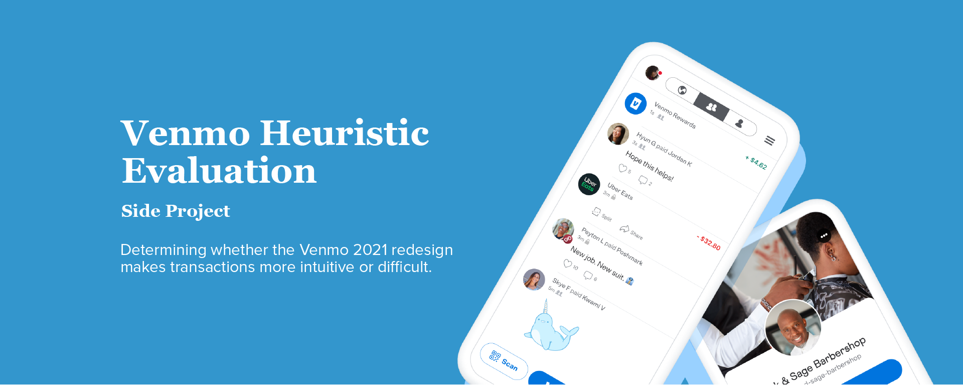
Summary
Venmo is a mobile payment service that makes money transfer easier for everyone. Earlier this year, Venmo changed the look and feel of its app, the most notable change being a more personalized feed. Even though Venmo desires to be a social platform, the primary user goal is to pay or request other people. The goal of this paper is to determine whether the redesign makes transactions more intuitive or difficult. The UX method used is a heuristic evaluation.
UX Evaluation and Analysis
I found this subject to be particularly interesting because e-commerce is one of the largest growing industries in the world. However, there is little margin for error when it comes to money and finances.

Evaluator: Ava Chen
Time Spent Evaluating: 1 Hour
Devices Used: Macbook Pro 13'' 2017, iPhone 12
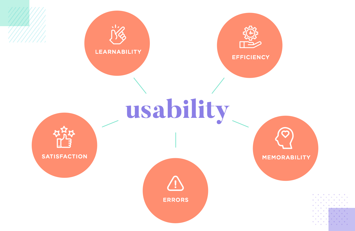
My heuristic evaluation is based on the UX Principles highlighted in class. I found that the UX principles, “Speak the User’s Language” and “Clearly Marked Exits”, had the most severe issues. UX principles “Shortcuts” and “Feedback” had the most important insights.
Results of Evaluation
Speak the User’s Language
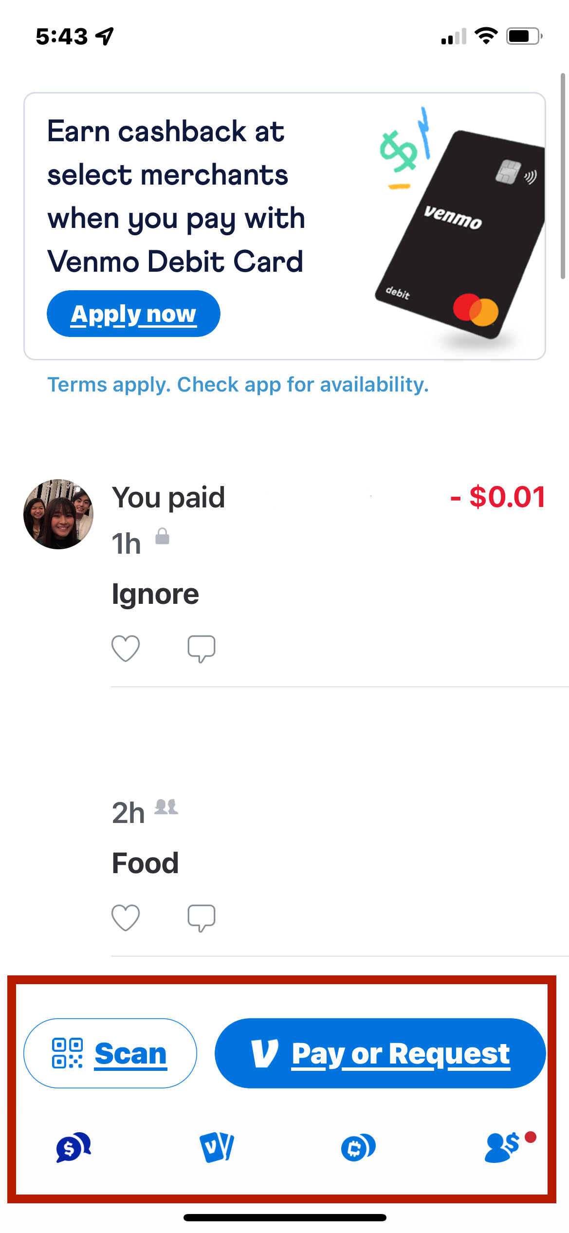
The Venmo mobile app and website violate this principle in several ways. One example is the button labeled “Pay or Request”. According to an article written by Callum Killby, button labels should be concise and should inspire action. However, the label “Pay or Request” implies a choice rather than a direct action and the use of “or” in a button label is unconventional, thus confusing users.

Shortcuts
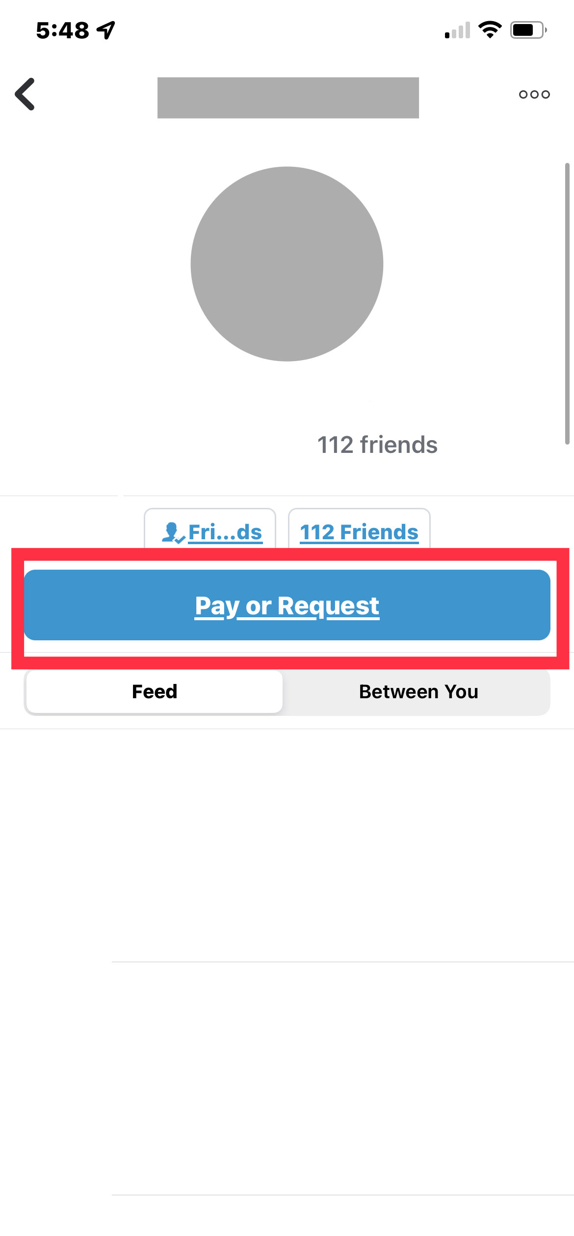
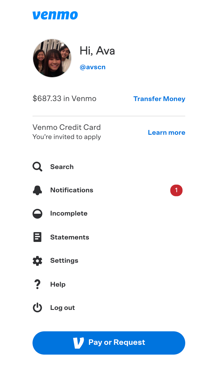
Venmo follows this principle with the “Pay or Request” button and the “Scan” button. These buttons are located where they are needed the most: on the home screen and a user’s profile. Visually, they are larger than the other interaction items on the app and website and are highlighted in blue color. Users can quickly spot these shortcuts and use them to their benefit.
When a user wants to send money to someone, they see a list of “Top People” with who they interact most on the app. This feature reduces the user’s memory load and makes it easier and faster to complete a transaction. Unfortunately, this feature is not available on the website version. (Mobile Ver. on the left, Web Ver. on the right)
Clearly Marked Exits
According to an article written by Demos in 2018, in an age of instant mobile money transfers, sending money to the wrong person is “no longer an uncommon occurrence”. In fact, due to the “Pay” and “Request” buttons looking visually the same, many people have sent money to the person instead of requesting.

Unfortunately, there is no option to cancel the payment, so users must communicate and rely on the recipient to send the money back to them. The lack of an “undo” feature makes the user feel trapped.
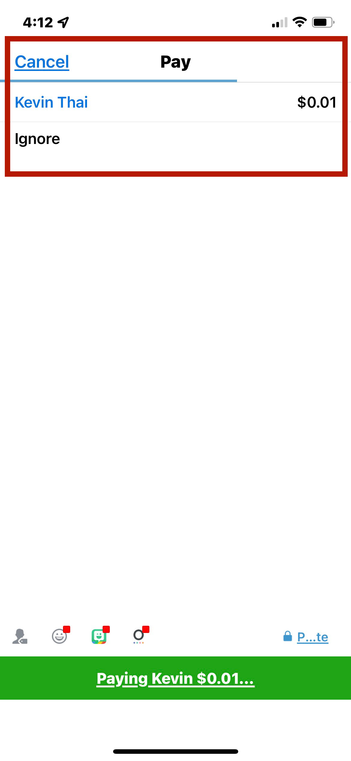
Feedback
While the user is trying to send money to another person, Venmo does a sufficient job of indicating the status of the transaction. When the user taps, “Pay” a line moves from the left to the right of the screen. Once the line reaches the right of the screen, it indicates to the user that the payment has been completed. To provide further feedback, a text message or email is instantly sent to confirm that you have successfully paid.
Conclusion
Venmo’s redesign still allows users to quickly pay or request others while giving appropriate feedback and suggestions to increase confidence and trust. However, the new layout involves new icons and buttons that are unfamiliar for users and does not provide a clearly marked exit that allows users to correct their mistakes.