Identifying Pain Points
Content Issues
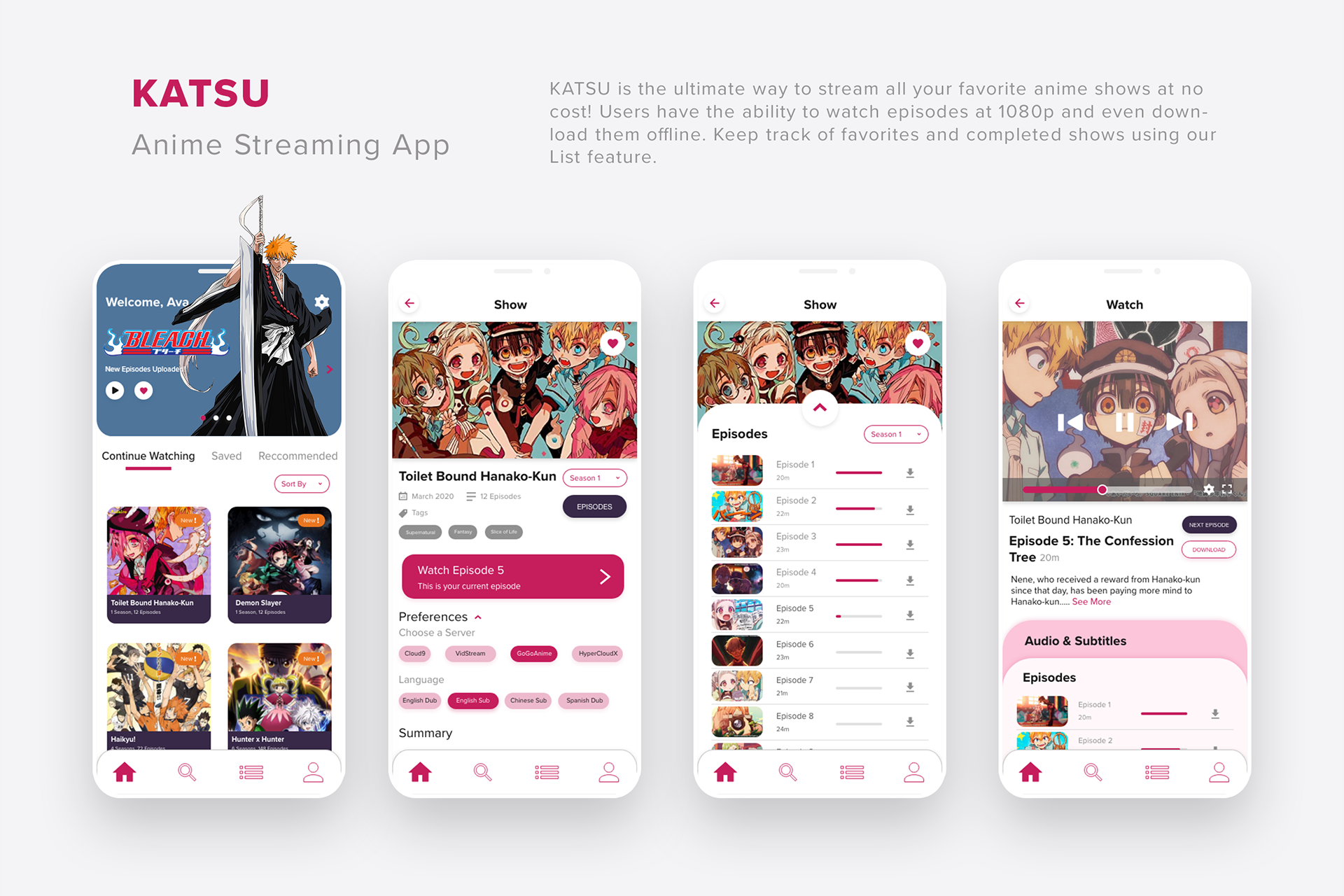
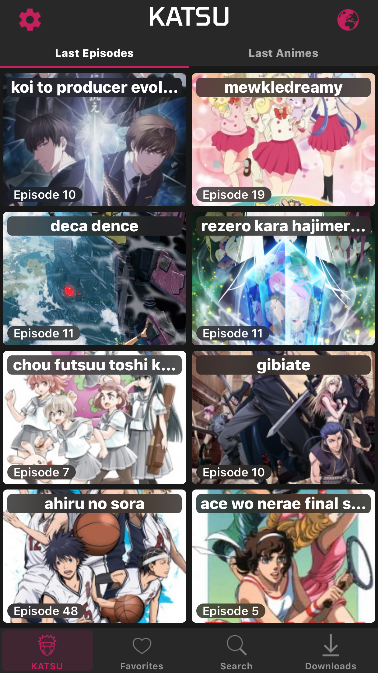
The KATSU app contains irrelevant content that fails to serve the user’s needs. When the user first opens the app, they are bombarded with recently updated anime shows. Each anime show is represented as a card and arranged in a 2 x 30 grid. This content is irrelevant for a home screen because the featured anime shows have no correlation to the user’s personal preferences or progress. It only overwhelms the user and forces them to work harder to reach their user goals.
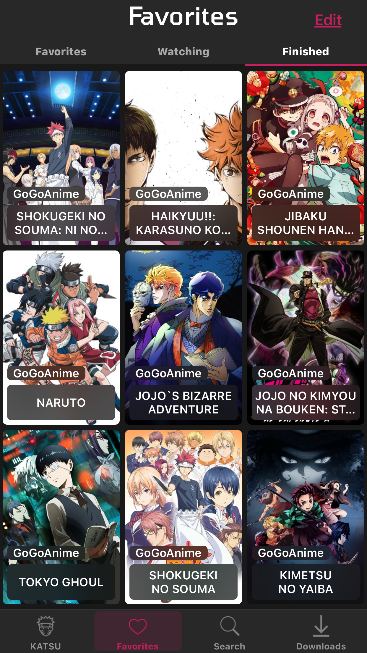
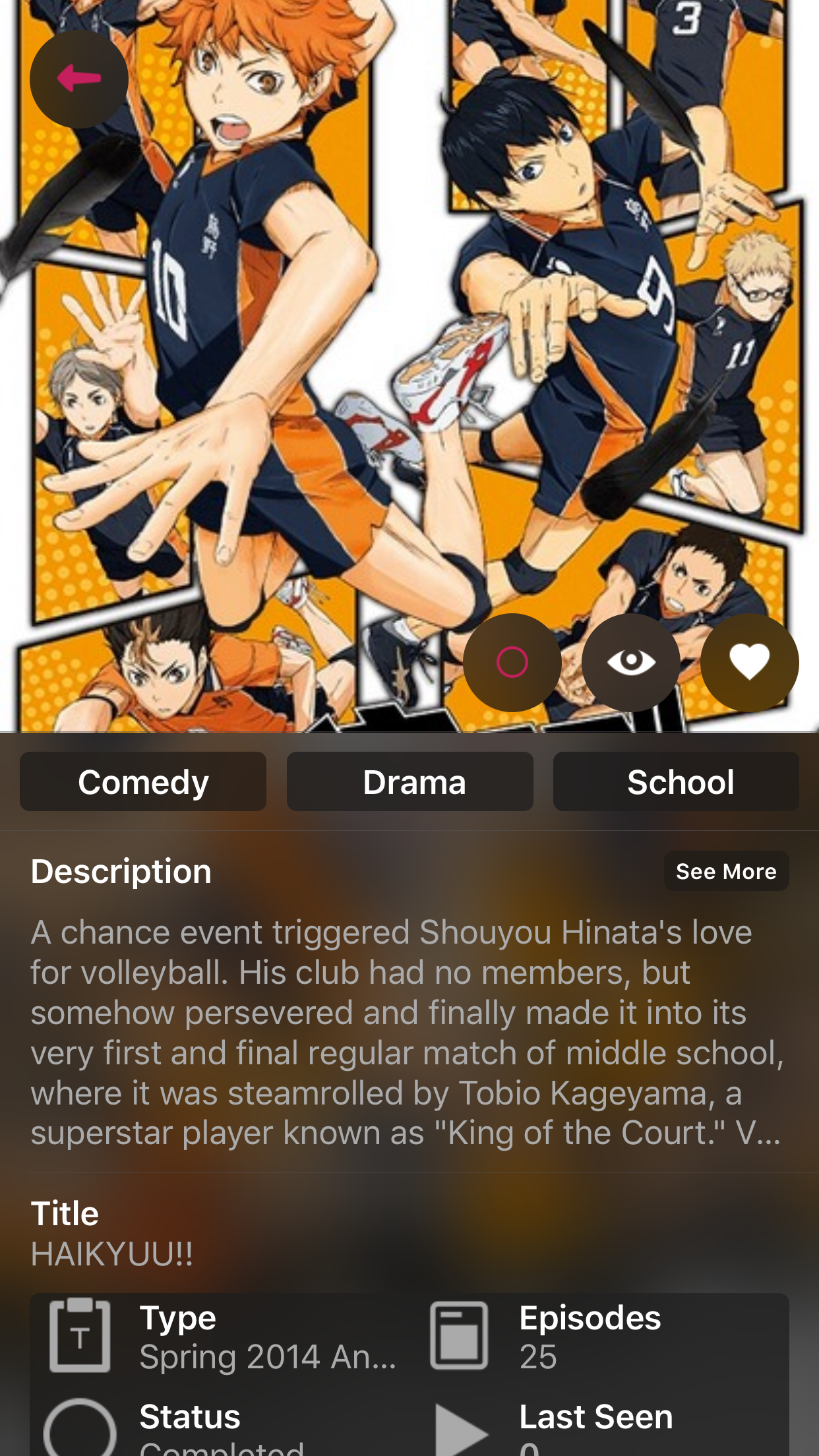
Despite the overwhelming amount of shows and updates on the homepage, the app generally lacks valuable content which causes an inefficient user experience. When the user searches for a specific anime, they can choose from their search results. When they tap on the desired show, there are three icons that represent “Favorite”, “Watching”, and “Finished”. However, there are no specific action words near the icons, which makes it difficult for the user to understand what these buttons mean.
Despite the overwhelming amount of shows and updates on the homepage, the app generally lacks valuable content which causes an inefficient user experience. When the user searches for a specific anime, they can choose from their search results. When they tap on the desired show, there are three icons that represent “Favorite”, “Watching”, and “Finished”. However, there are no specific action words near the icons, which makes it difficult for the user to understand what these buttons mean.
Visual Design Issues
Overall, the visual design of this app is very dull and has several typography issues. When the user is on the home screen, the UI Labels of the anime shows are in lowercase. However, if the user searches for a specific show, their search result labels are all uppercase. Because there is little typography cohesion, the user may think that there is a difference between the anime UI Labels on the home screen and the ones in the search results.
Furthermore, the layout of the app makes navigation difficult and less visually appealing. On the home screen, the user encounters a grid with very little spacing in between. Furthermore, most of the UI Labels are cut off. If the user toggles between “Last Episodes” and “Last Animes” on the home screen, they will notice that the layouts are both different. Instead of two cards in one row, there are three. Even though “Last Episodes” and “Last Animes” essentially serve the same overall purpose, the design is different. The layout of the home screen makes the design look cluttered and unorganized.
Furthermore, the layout of the app makes navigation difficult and less visually appealing. On the home screen, the user encounters a grid with very little spacing in between. Furthermore, most of the UI Labels are cut off. If the user toggles between “Last Episodes” and “Last Animes” on the home screen, they will notice that the layouts are both different. Instead of two cards in one row, there are three. Even though “Last Episodes” and “Last Animes” essentially serve the same overall purpose, the design is different. The layout of the home screen makes the design look cluttered and unorganized.
Usability Issues
The lack of user activity on the home screen makes the user feel like they are not engaging with KATSU. As mentioned before, on the home screen, the user can only see KATSU’s activity, which includes what anime shows the app has added and what episodes have been recently uploaded. The user cannot see what shows they are currently watching or their progress on a specific episode. Instead, they must use multiple actions to watch something. This makes the user feel forgotten and think that they have no control when using the app.
Another usability issue is the unavailability of back or cancel buttons in the app. When the user clicks on an episode, several pop-ups appear. The first pop-up is choosing the server to play the episode on, and the second pop-up asks if the user would like to “Play” or “Download” the episode. However, the flow does not include the option to go back to the episode list. Therefore, if the user accidentally clicks on the wrong episode, they will have to complete the two popups, play the episode, and then tap “Cancel” to return to the episode list. The missing back or cancel buttons makes the user feel hesitant when making decisions on the app. They may be afraid to make a mistake when tapping on an episode because of the time consequences they will face. What should be fast tapping actions now becomes slow, hesitant decisions that make the user experience more tedious and frustrating.
Another usability issue is the unavailability of back or cancel buttons in the app. When the user clicks on an episode, several pop-ups appear. The first pop-up is choosing the server to play the episode on, and the second pop-up asks if the user would like to “Play” or “Download” the episode. However, the flow does not include the option to go back to the episode list. Therefore, if the user accidentally clicks on the wrong episode, they will have to complete the two popups, play the episode, and then tap “Cancel” to return to the episode list. The missing back or cancel buttons makes the user feel hesitant when making decisions on the app. They may be afraid to make a mistake when tapping on an episode because of the time consequences they will face. What should be fast tapping actions now becomes slow, hesitant decisions that make the user experience more tedious and frustrating.
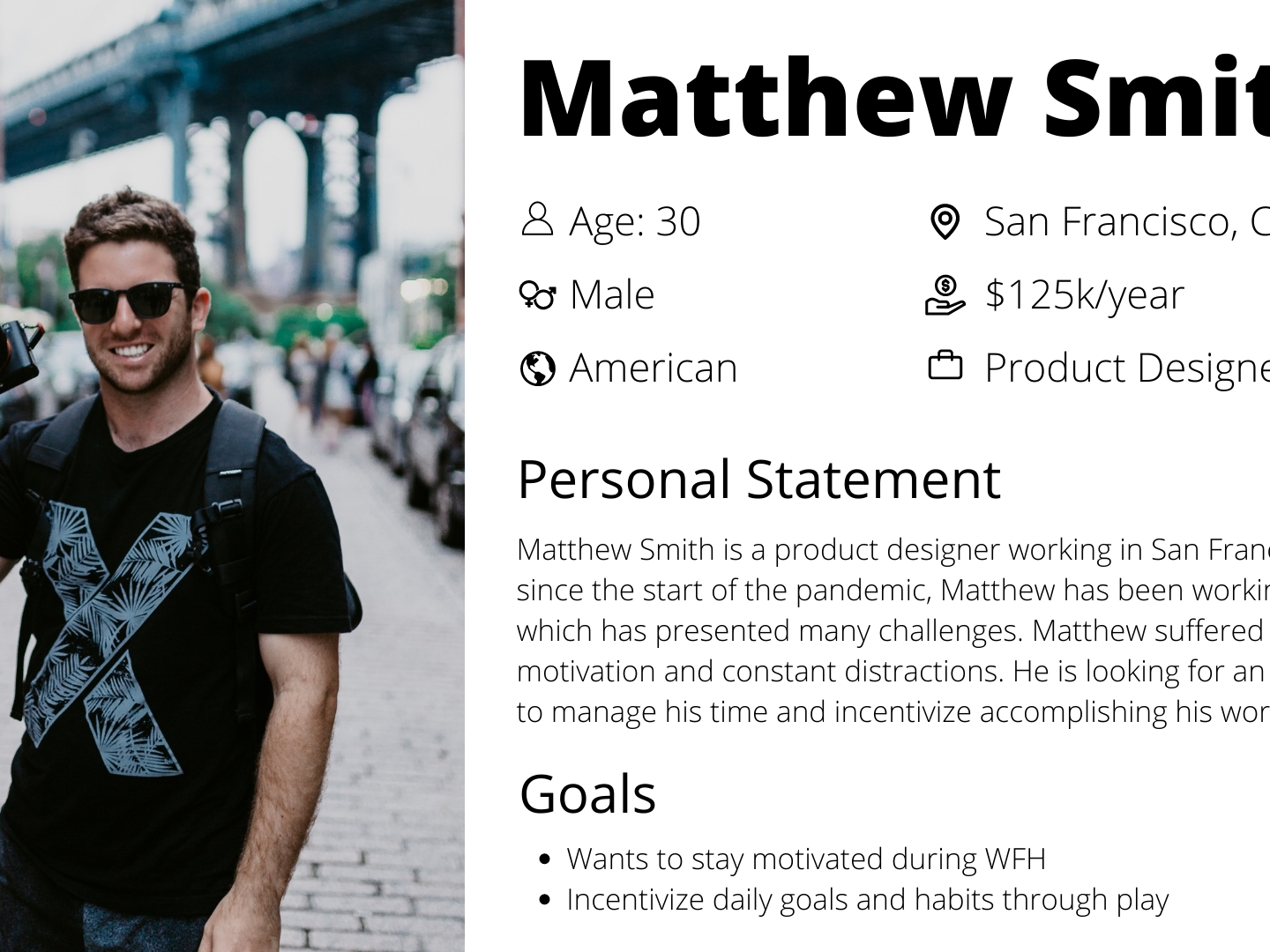
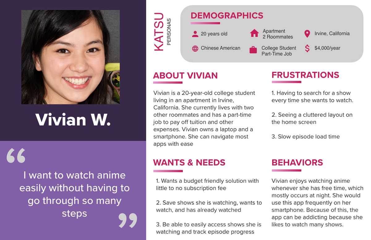
Creating a User Persona
User Task Flow
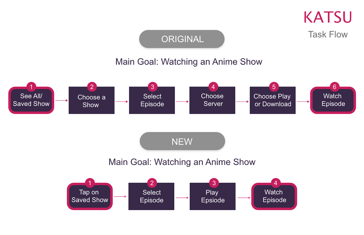
I wanted to simplify the process of watching an episode on this app. In order to do this, I created a task flow outlining the original steps taken to watch an episode. Then I designed a new task flow that shortened the steps and made it clear where and how to watch an episode.
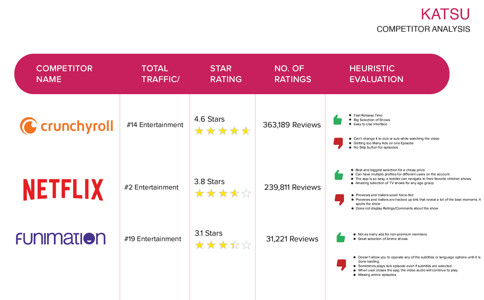
Competitor Analysis
I wanted to gain more insight on other apps or competitors. I compiled a chart that outlined the pros, cons, and ratings of the app. This gave me a full assessment of other app's weaknesses and strengths. From there, I was able to learn what features or experience the audience wants and what the audience does not want.
Designing Screens for my Task Flow
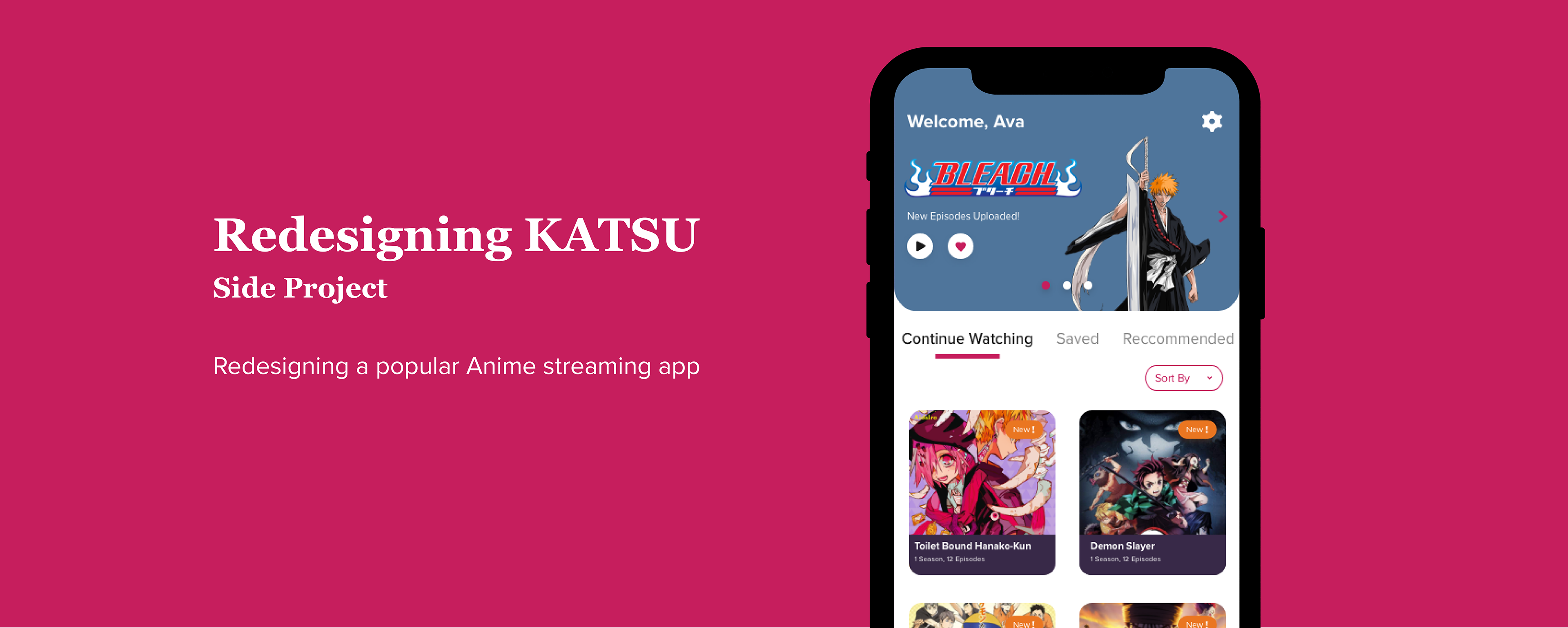
Based on my task flow and basic research, I was able to redesign the visuals of the app and the user flow. I designed for main screens that the user would visit to watch an episode. I tried to incorporate the pink color more often instead of the gray. I believe that the pink color makes the app look more exciting and vibrant